Ilant Health
An obesity healthcare platform based in New York, helping members navigate their personalized care journey.
Redesigning the Lab Results Experience

Project Overview
Product Design · UX · UI · Information Architecture · Prototyping
Ilant Health Member App · New York
Ilant Health is a healthcare company focused on helping people navigate and access personalized obesity care.
The Member App supports members throughout their care journey, guiding them through the steps required before beginning treatment and connecting them with the people and information needed along the way.
One critical part of this journey was Lab Work.
Members needed to complete or provide recent lab results before their Medical Visit, but the existing experience treated this requirement as just another task on a checklist.
The challenge
A completed step didn't mean the member was ready for care.
Ilant Health's Member App guides members through the steps required to begin their personalized care journey.
However, the experience wasn't providing enough clarity or confidence throughout that journey. The app needed to better communicate what members needed to do, why each step mattered, and what would happen next.
One critical example was completing Lab Work.
The experience seemed simple:
Complete Lab Work → Mark as Done
But there was a critical problem.
Members could mark the step as complete without providing any lab results. As a result, a step could appear finished even though the care team still lacked the information required to move forward.
The challenge was to redesign the experience around greater clarity, confidence, and engagement, while ensuring that completing a step actually meant the member was ready to progress in their care journey.
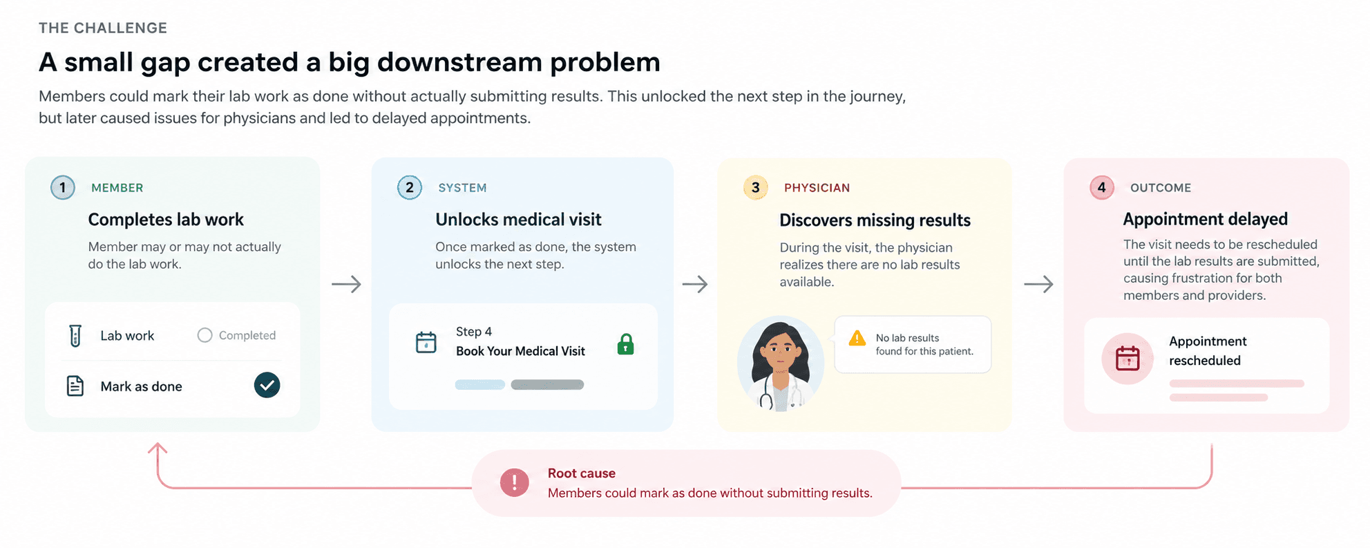
This created delays, unnecessary work, and sometimes required appointments to be rescheduled.
The scale of the problem
~95%
of members who marked Lab Work as complete had not actually completed the required tests.
Project Goals
Increase meaningful completion
Make dependencies clear
Support different real-world paths
Understanding the problem
The interface was only part of the problem.
The data showed that something was wrong, but I needed to understand why members were progressing through the flow without completing the actual task.
I looked at the problem from multiple perspectives:
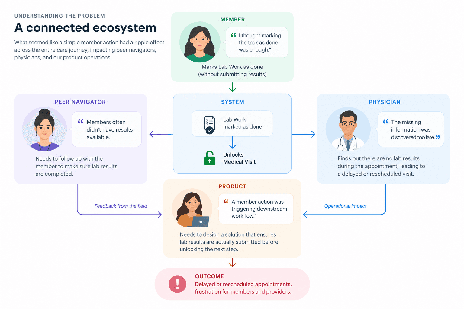
Members
Session reviews and interaction data helped me understand how people interpreted the existing onboarding experience.
Peer Navigators
They repeatedly encountered members who had marked Lab Work as complete but didn't have results available.
Physicians
They experienced the consequences downstream when missing information was discovered during the Medical Visit.
Product
I worked with Product leadership to connect the member experience to the operational workflow.
The key insight
The product treated a real-world healthcare task like a checkbox.
The issue wasn't simply that members were making mistakes.
The product itself created ambiguity around what “complete” actually meant.
A member could have:
Recent digital lab results
A physical copy
A screenshot
Results that were too old
No recent results at all
The original experience didn't represent these different realities.
The product was asking members whether they had completed a task instead of helping them actually complete it.
Reframing the problem
From "Did you do it?" to "Let's help you complete it."
This became the design principle behind the redesign.
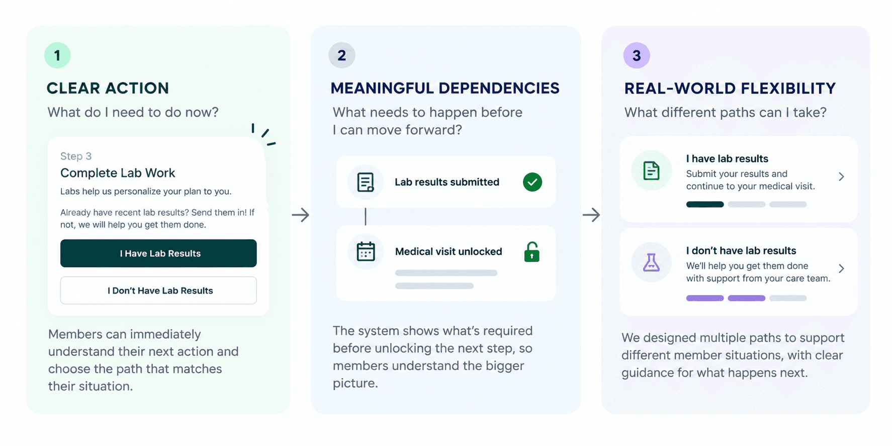
I needed to redesign the experience around three things:
Rethinking the onboarding experience
The journey needed to reflect how care actually happens.
The redesigned journey
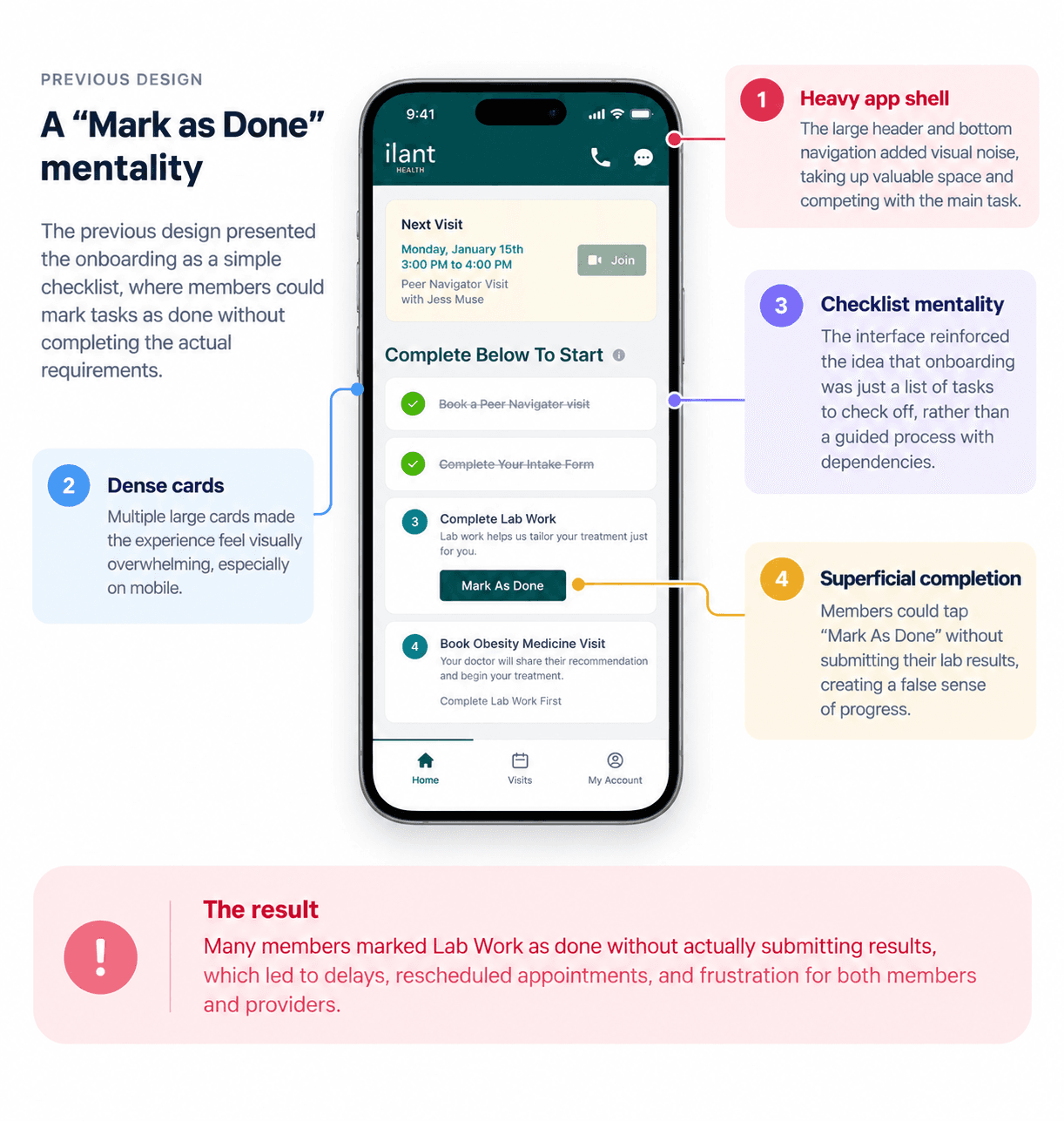
Before: the product flow

Previous Design
Heavy, dark green header
Predominantly gray background
Dense cards, little breathing room
Checklist-like presentation
After: the care workflow
New Design
Lighter header, reduced visual weight
Subtle gradient, more modern tone
Current step as clear visual focus
Upcoming vs. completed states clearly differentiated
A guided care journey.
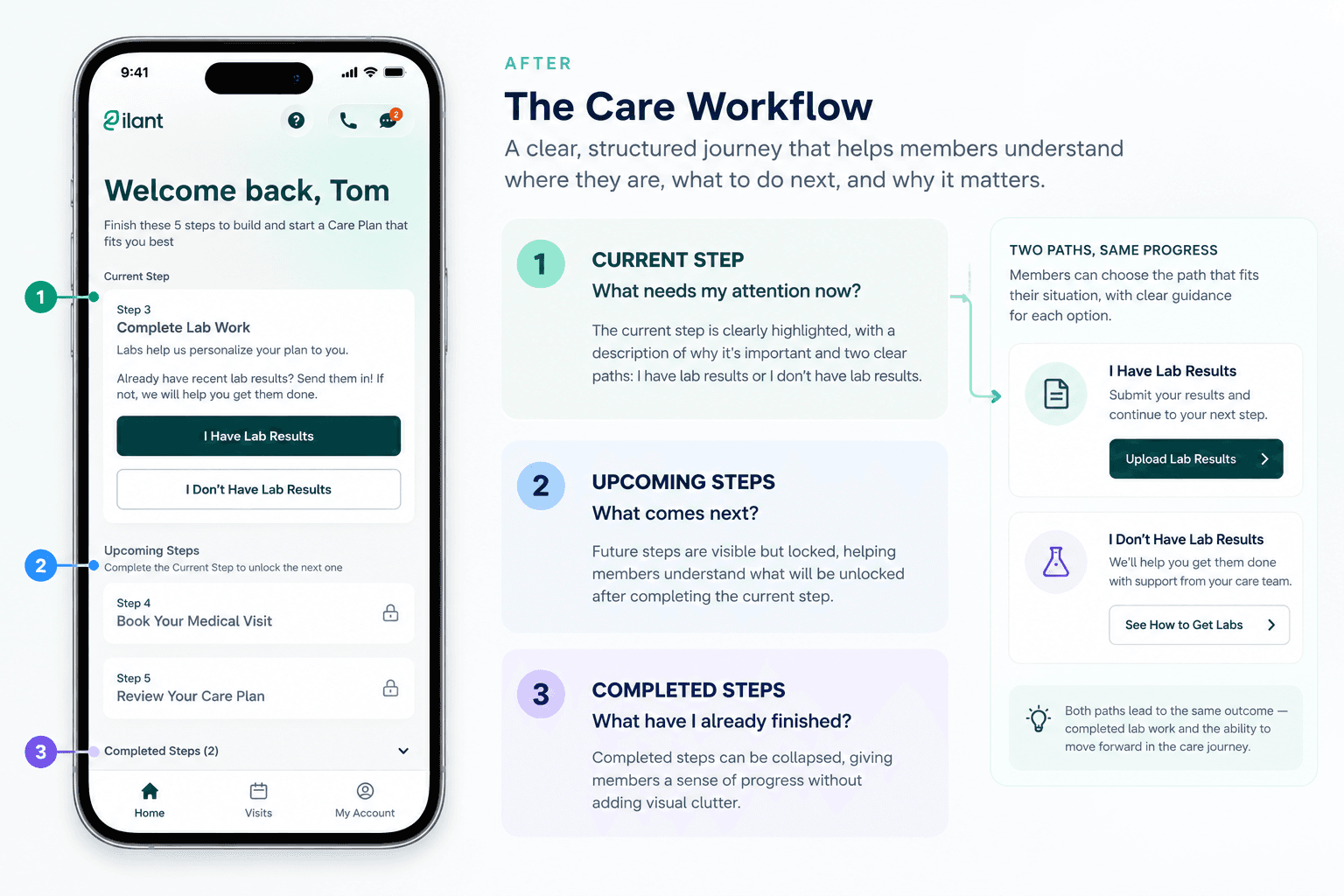
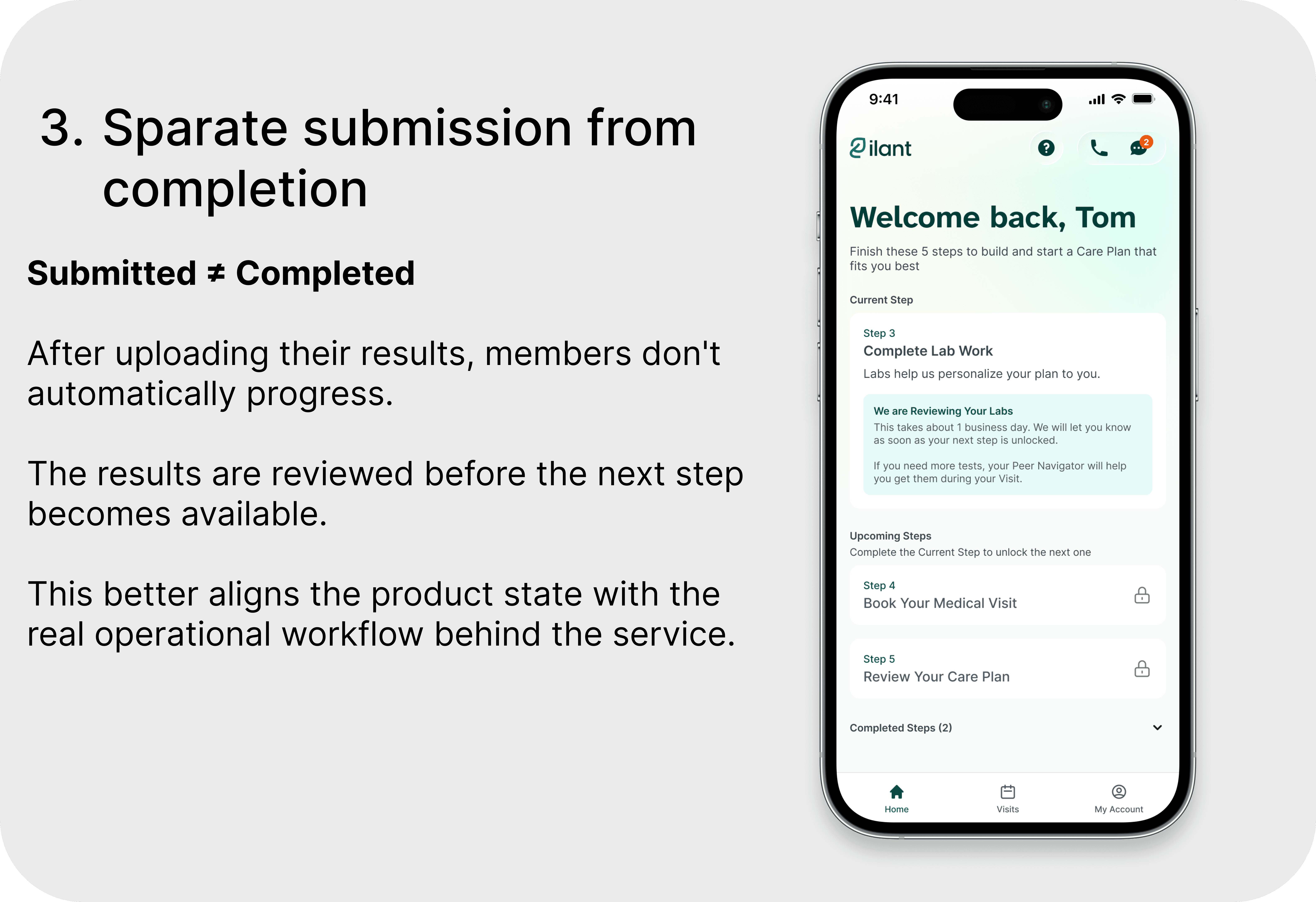
The new architecture also introduced explicit dependencies between steps.
For example:
Lab Work must be completed and reviewed before the Medical Visit becomes available.

A second problem: the interface felt transactional
The visual redesign supported the new experience.
The previous experience relied on a heavy app shell, gray backgrounds, dense cards, and a checklist-like presentation.
As the onboarding became more guided, the visual language needed to support that shift.
I introduced:
A lighter app shell: Reduced the visual weight around the content.
Stronger hierarchy: Made the current action the focal point of the screen.
Clearer states: Created distinct visual treatments for current, upcoming, and completed steps.
Ambient motion: Replaced the static background with a subtle animated gradient that slowly shifts over time. The movement adds a softer, more welcoming sense of life to the experience without competing with the member's primary task.
More breathing room: Refined spacing and layout to make the experience easier to scan.
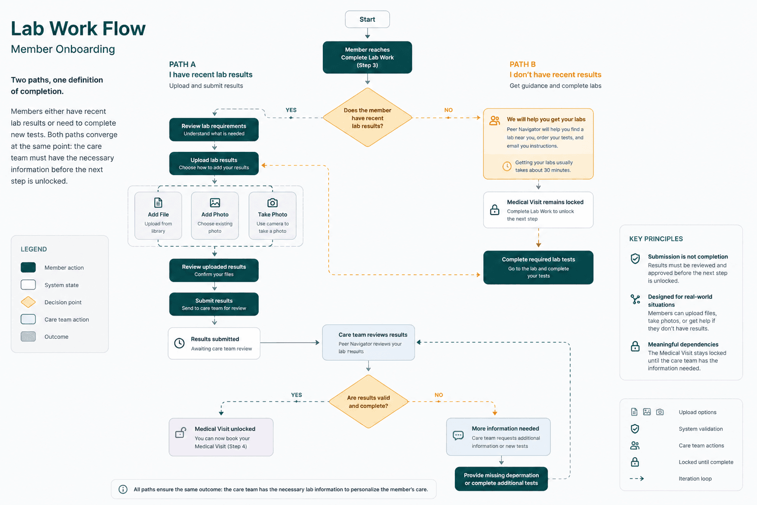
The critical workflow: Lab Work
From "Mark as Done" to a reliable workflow.
The redesign replaced a self-reported completion state with a workflow that better represented what actually needed to happen.
Designing for real-world situations
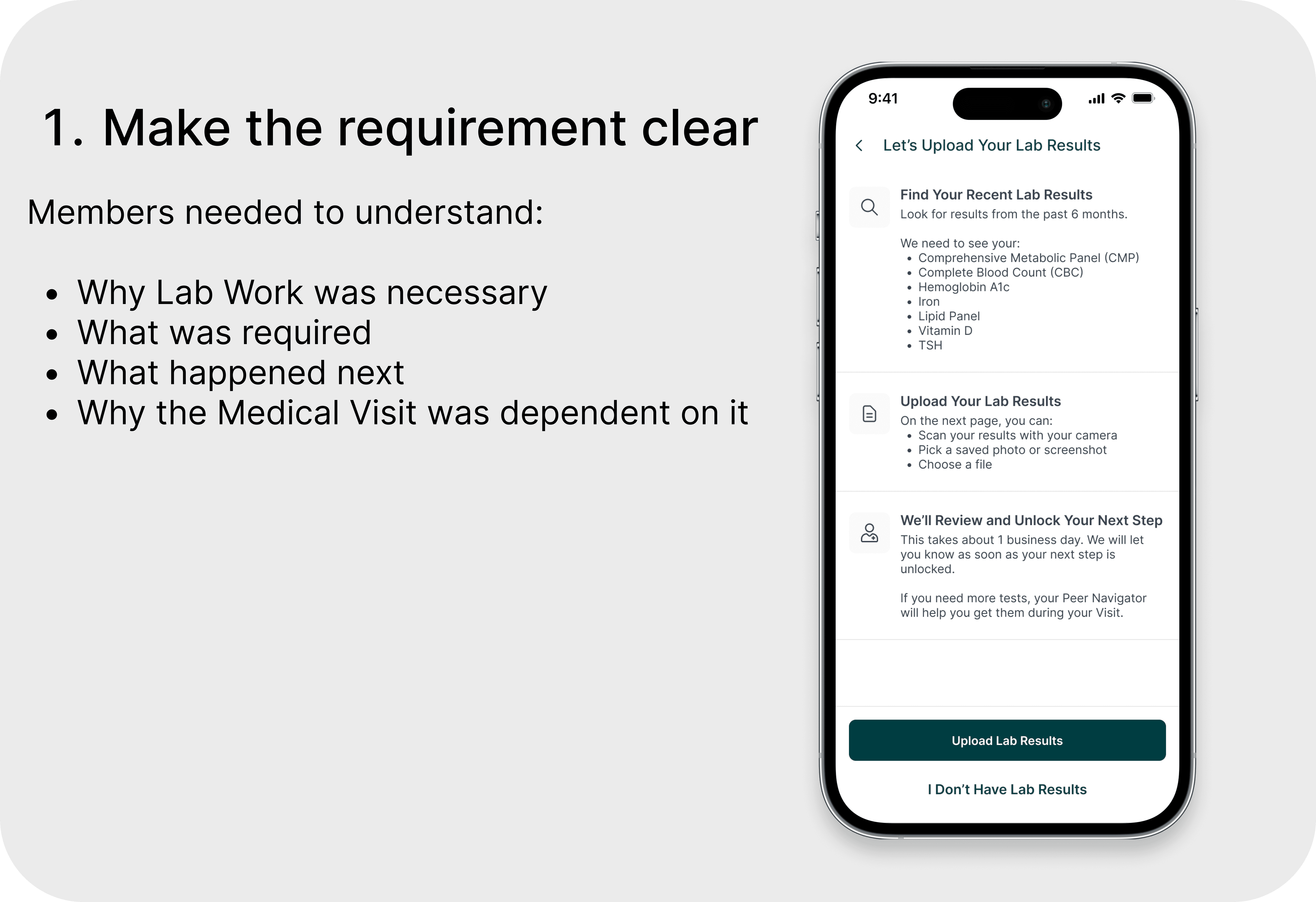
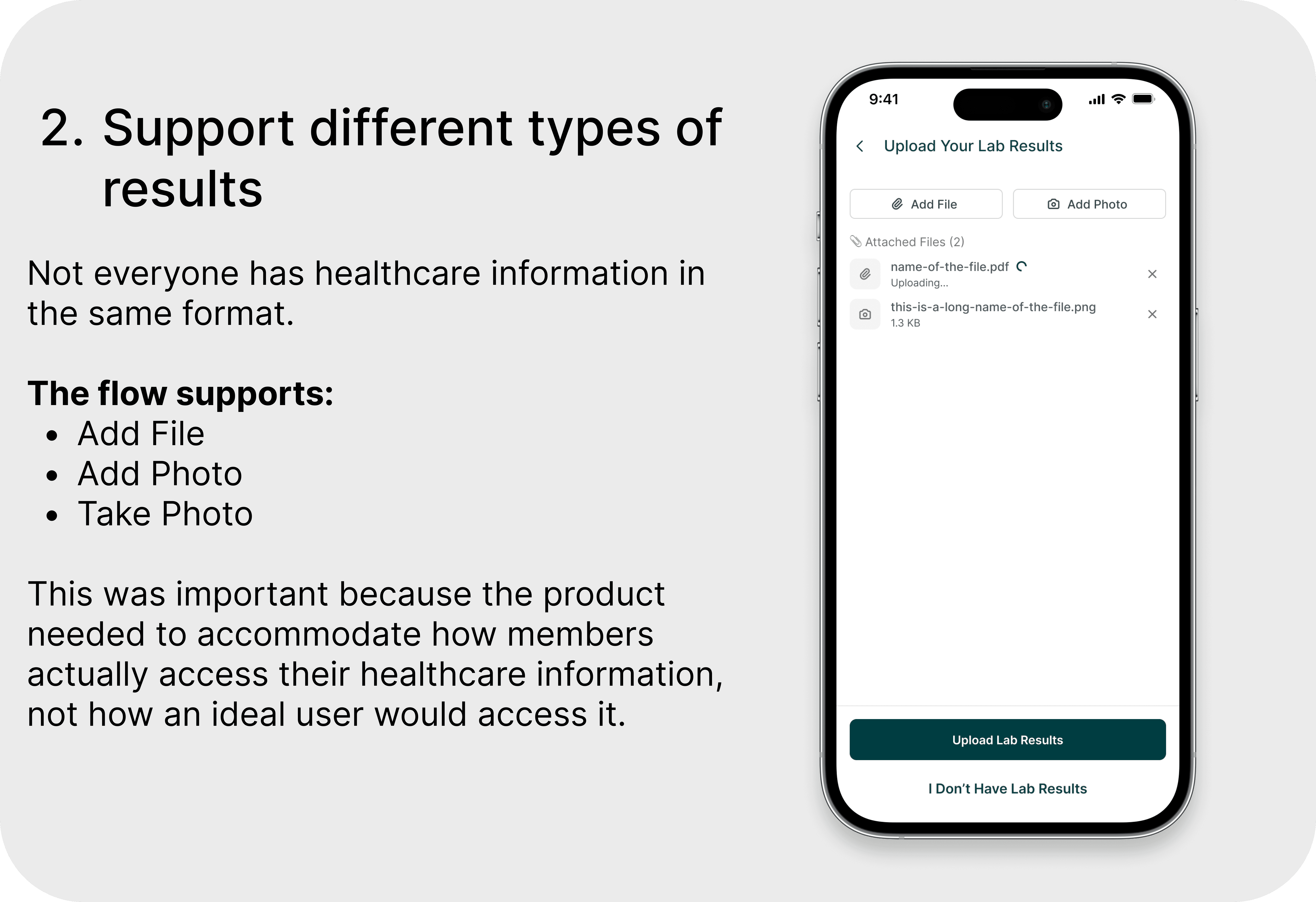
The outcome
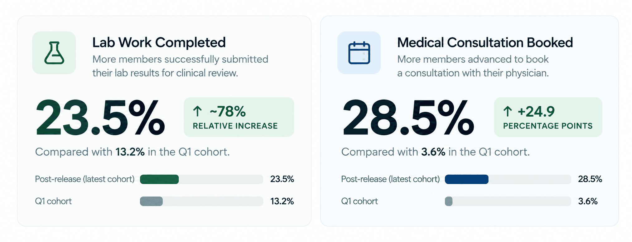
Stronger progression from Lab Work to care
After the redesign, early post-release cohorts showed stronger progression through two critical steps in the care journey.
Beyond the metric
The workflow changed how members moved through care.
Qualitatively, the team reported that members were no longer booking Medical Visits without having lab results available.
The redesigned experience created a clear relationship between action and progress:
I have lab results
↓
I upload them
↓
The care team reviews them
↓
My next step becomes available
What I learned
A simple interface isn't always a simple experience.
The old flow had fewer interactions, but fewer interactions didn't mean less friction. A single "Mark as Done" button was creating confusion across the entire care journey. When a digital interaction represents a real-world action, the product has to accurately represent the state of that action. The goal was never to get members to click "done." It was to help them actually be ready for care.