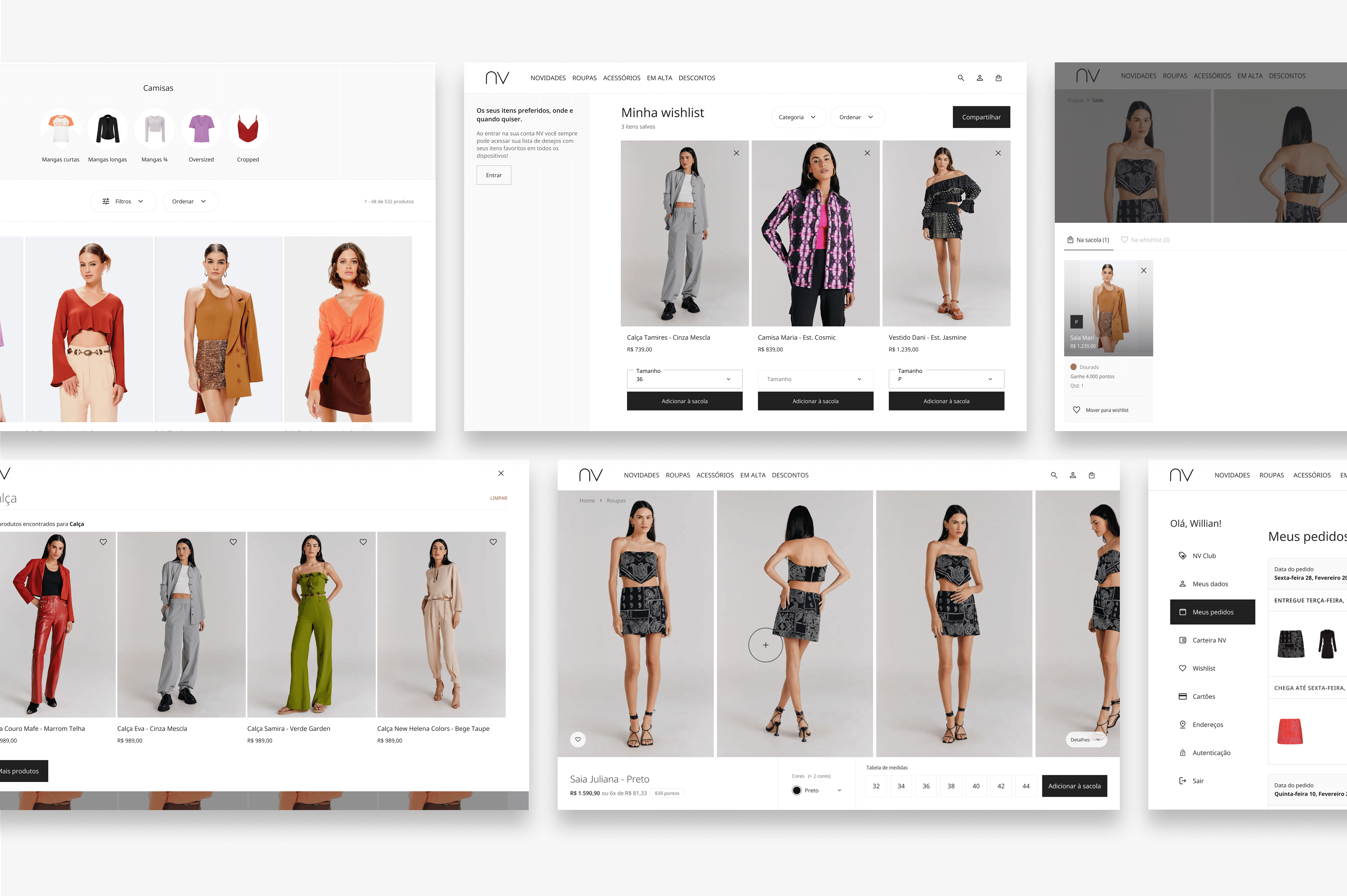
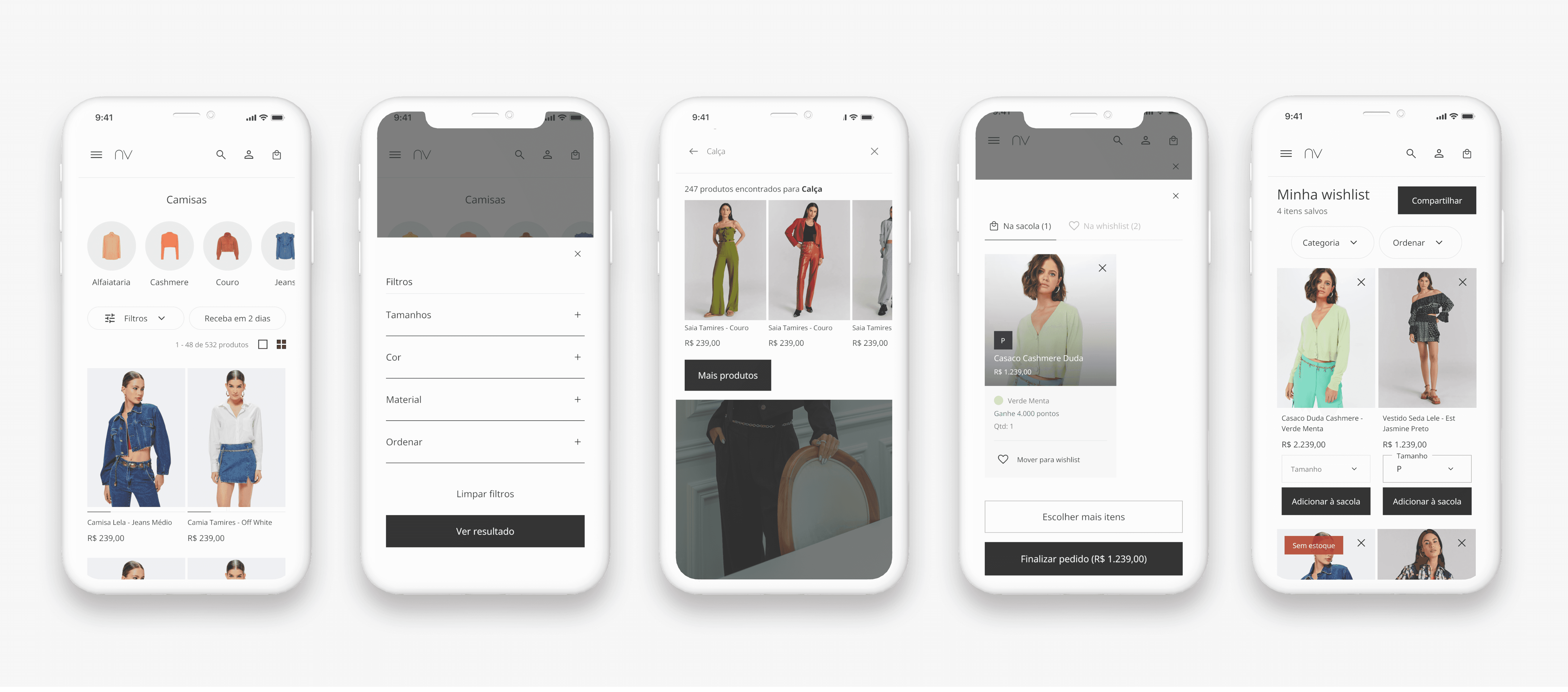
NV
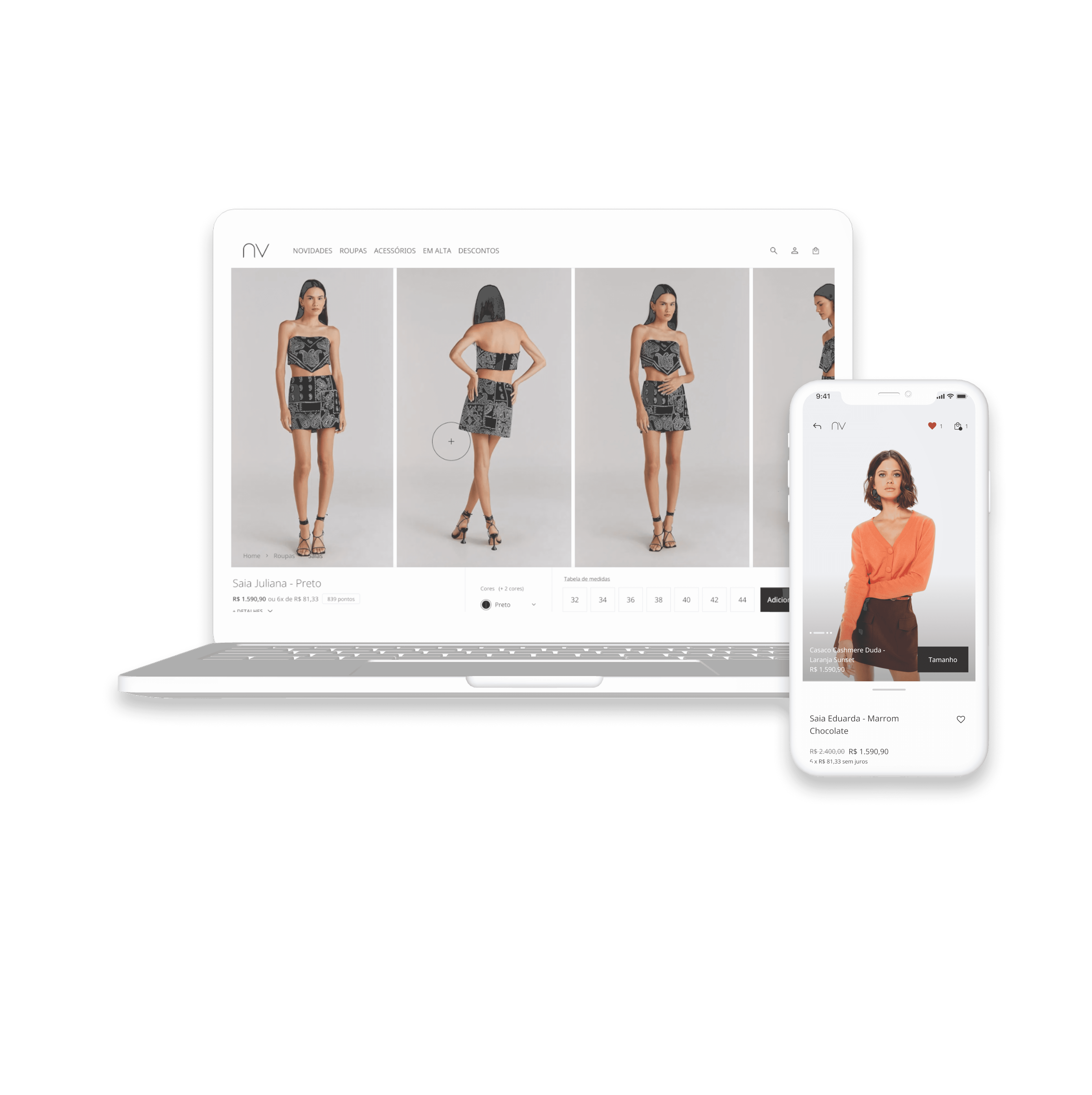
NV is a Brazilian luxury fashion e-commerce. This project focused on creating a more intuitive shopping experience that better reflected the brand.
Redesigning the Product Page
The Overview
Product Design · UX · UI · Information Architecture · Prototyping
NV · 2023
NV it's an e-commerce and was founded by the influencer Nati Vozza in 2009 and was sold to Grupo Soma. The website has almost 1 million access monthly. NV has more than 16 stores around Brazil. After many successes, NV decided to expand the e-commerce and launched international e-commerce.
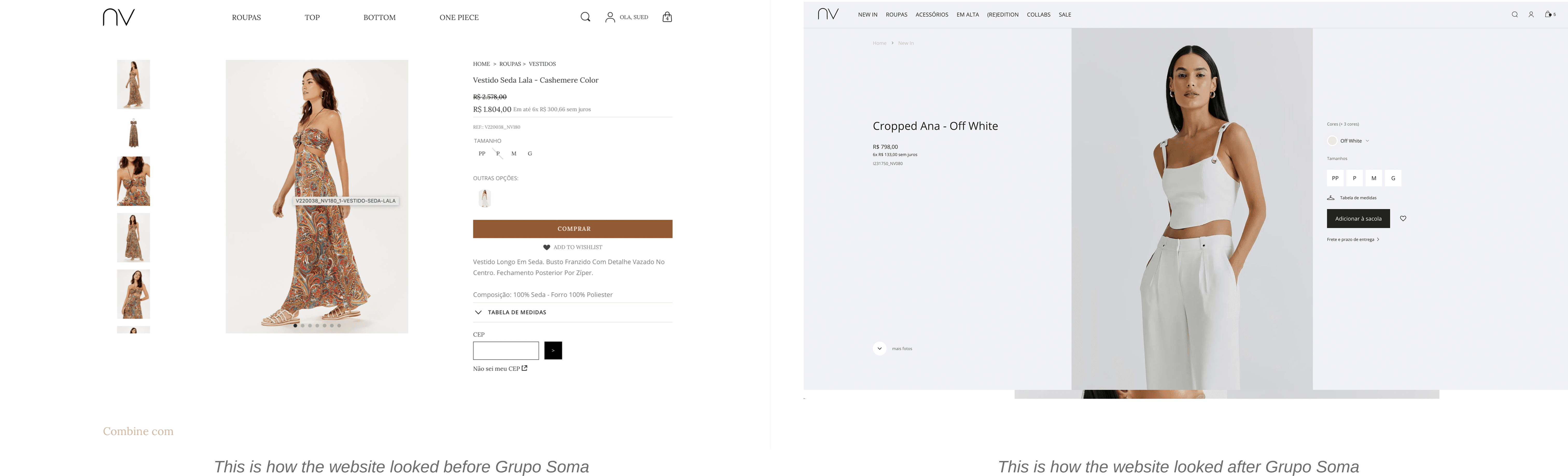
Since NV was sold to Grupo Soma, the website has never gone through by improvements. The website is focused on clients with high purchasing power, and the e-commerce hadn't an elegant and clear experience to shop. There wasn't any relationship with the physical store.
The Problem
Sales were being affected by usability problems on the website, in addition, users weren't feeling confident to buy online. For example: Users needed to click many times to be able to see all the product pictures, as well as the users had difficulties to find what they were looking for because the menu navigation it was confused.
Business Goal
Increase the sales through the website
Give more confident to our users
Design Process

Competitor Research
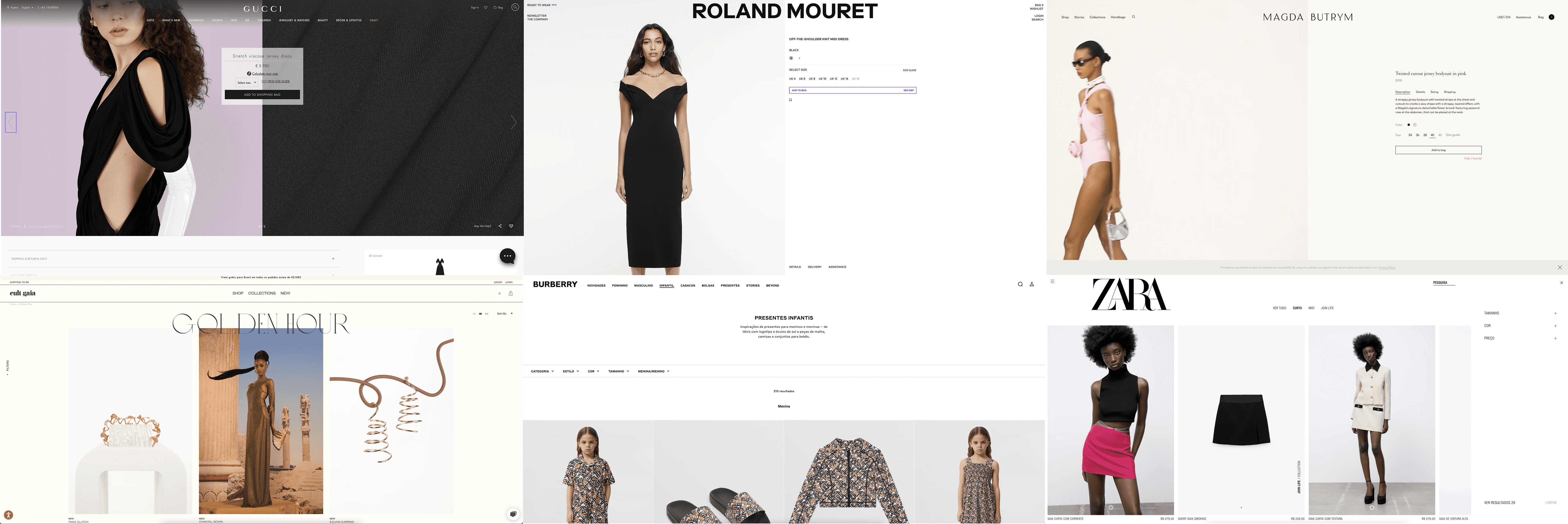
So I made a research to verify how other brands behaved to collect insights of improvements for the product page designs aiming to make it clear, more elegant and easier to interact.
User research
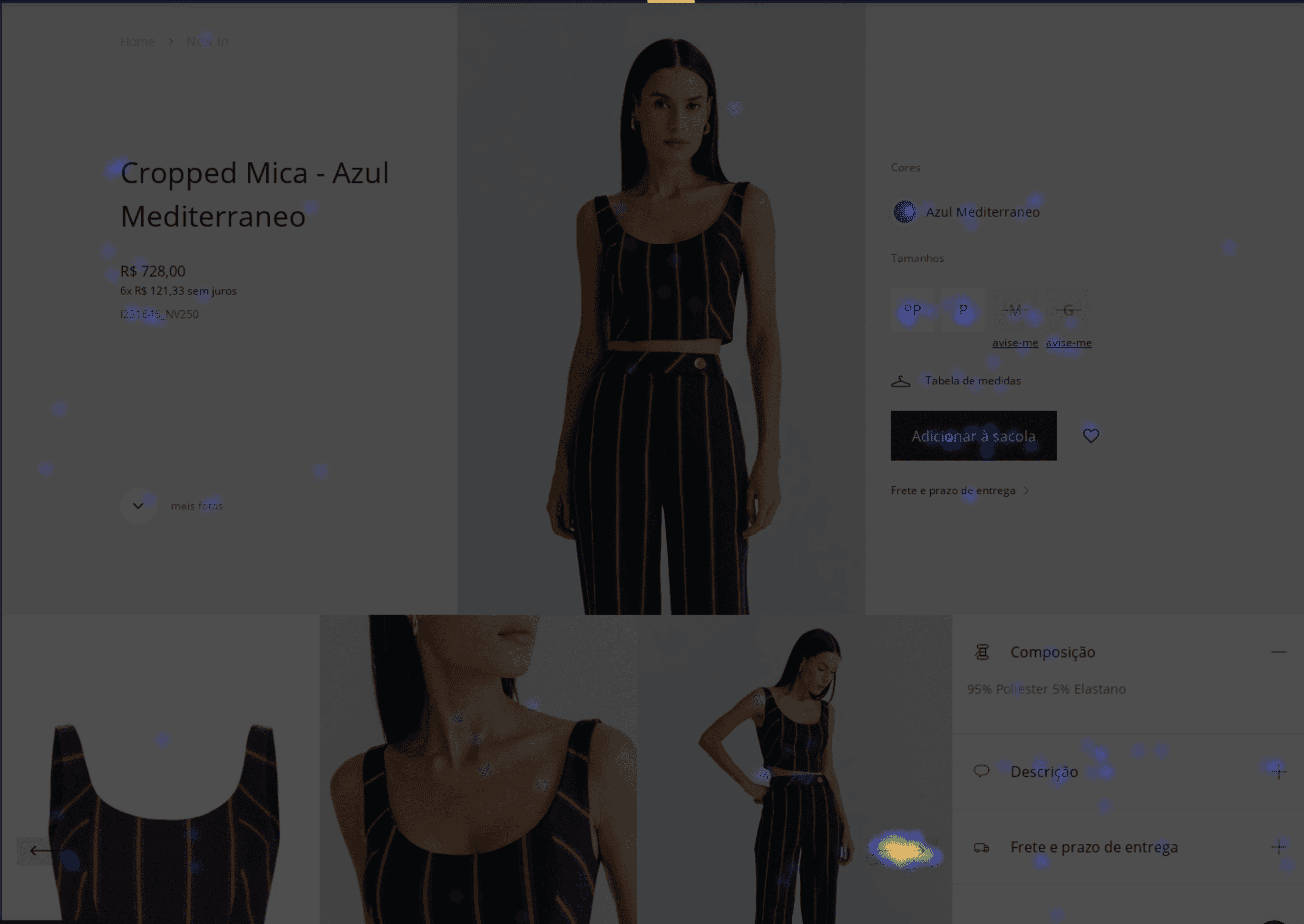
I interviewed the users to get information about their experience and understand their pains while interacting with the page. In addition I used the heatmap tool to check how was their interaction.
With these information I was able to create the users personas to better understand each profile goal, their needs, how they interact individually with the webpage and which method of access they use.
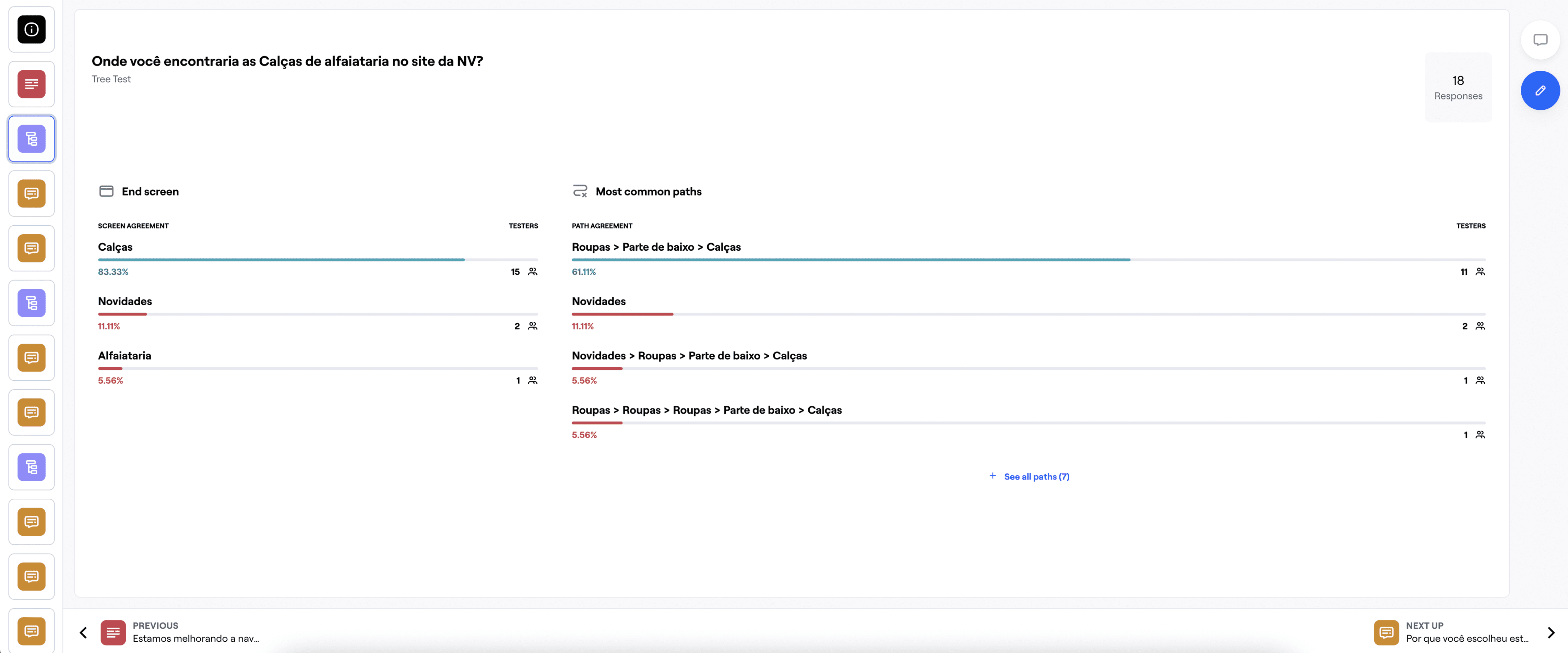
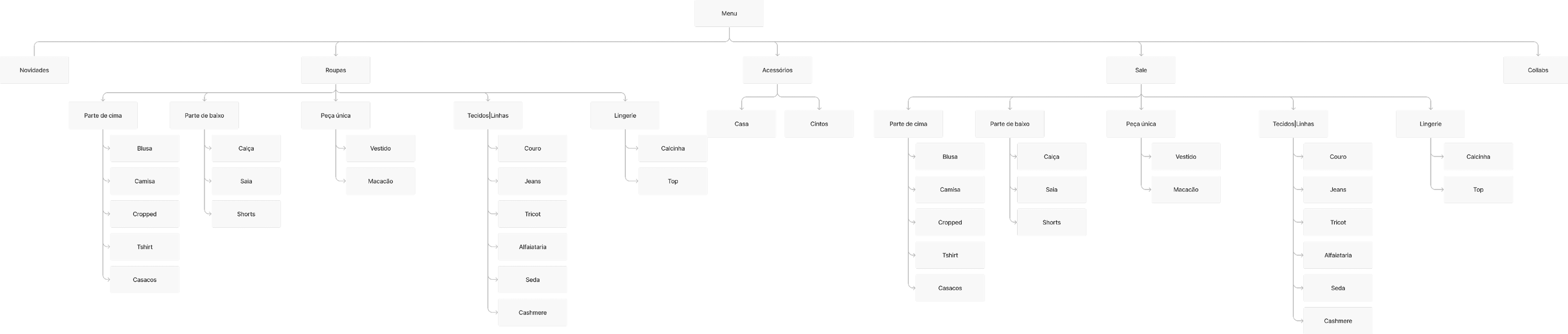
To help with the deffinitions of new menu navigation and to identify where should be each category I applied a tree test using Maze to our users. After the test I suggested a new hierarchy for the menu.
Information Architecture / Hierarchy
I improved the information architecture suggesting new ways to nagivate on the website making the user experience easier, intuitive and faster.
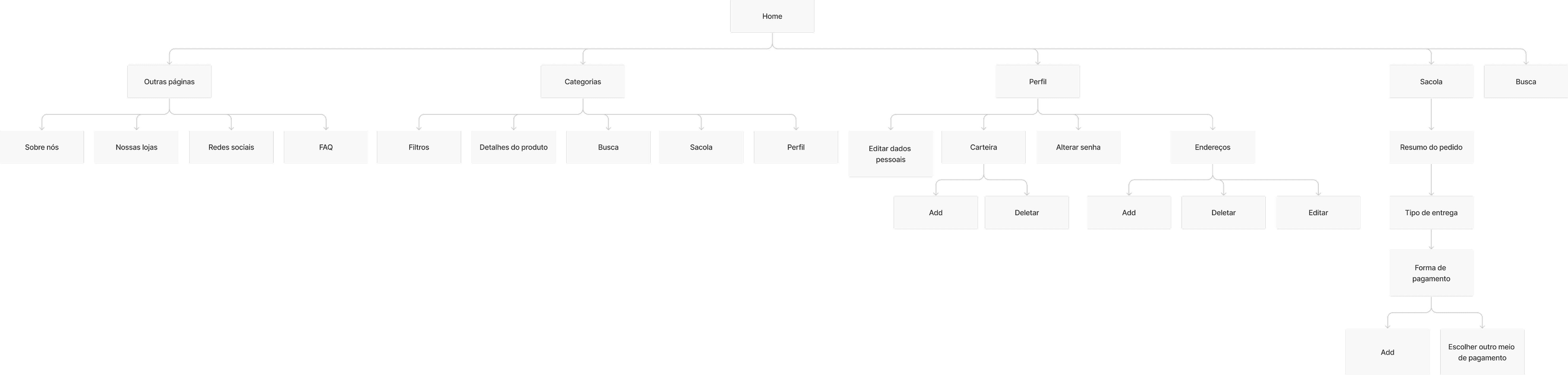
This is the new menu navigation after the tree test.
Usability Test
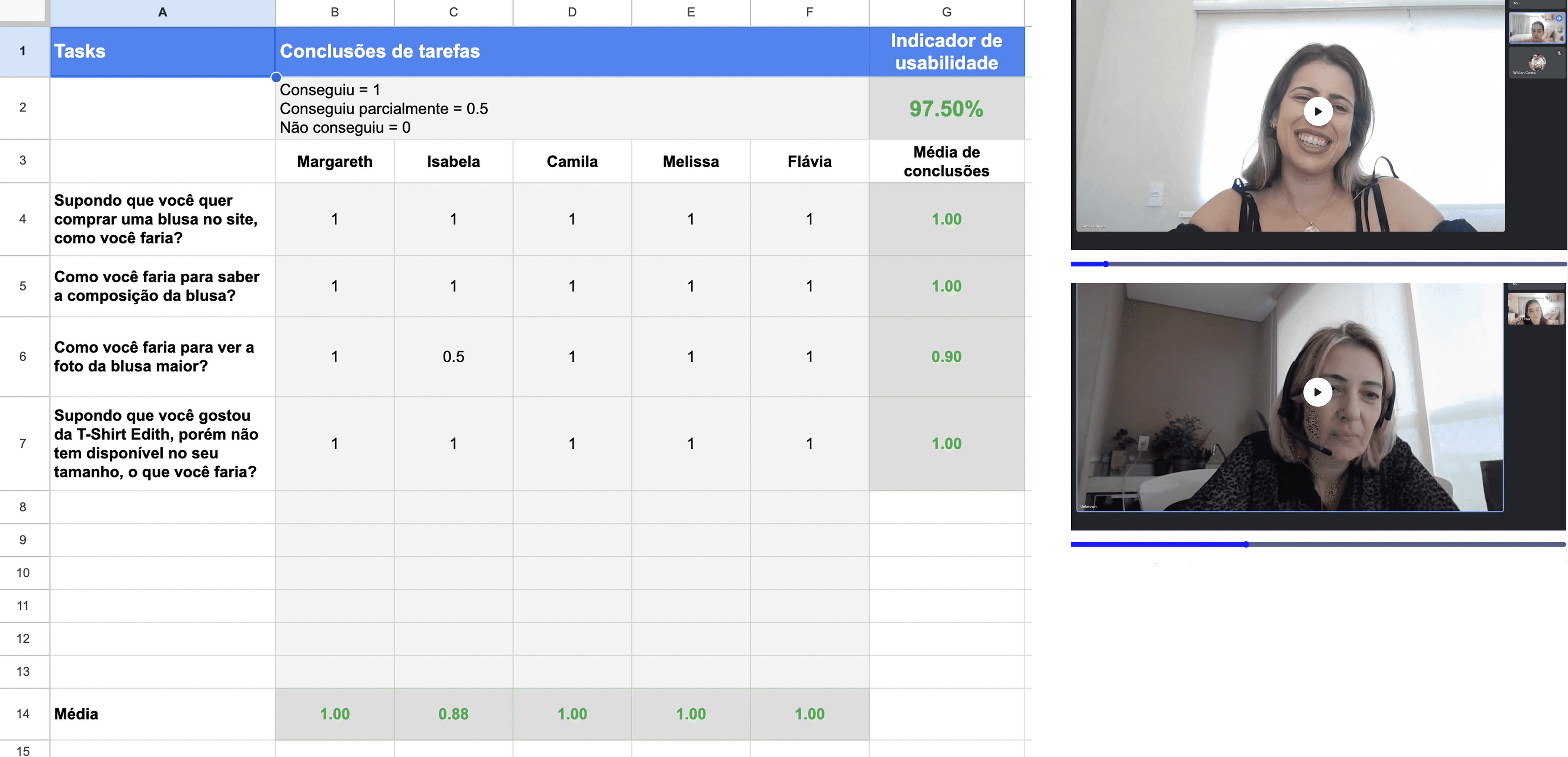
With the prototypes the usability test was applied to 5 users to identify pains, improvements and check the difficulty level they would have to use the new product page. To measure the usability test, a spreadsheet was created containing tasks made by the users, their comments and selection with the following options: Managed, Parcially managed or failed. Each option had a different score. Managed: 1 point, Parcially Managed: 0.5 point and Failed: 0 points.
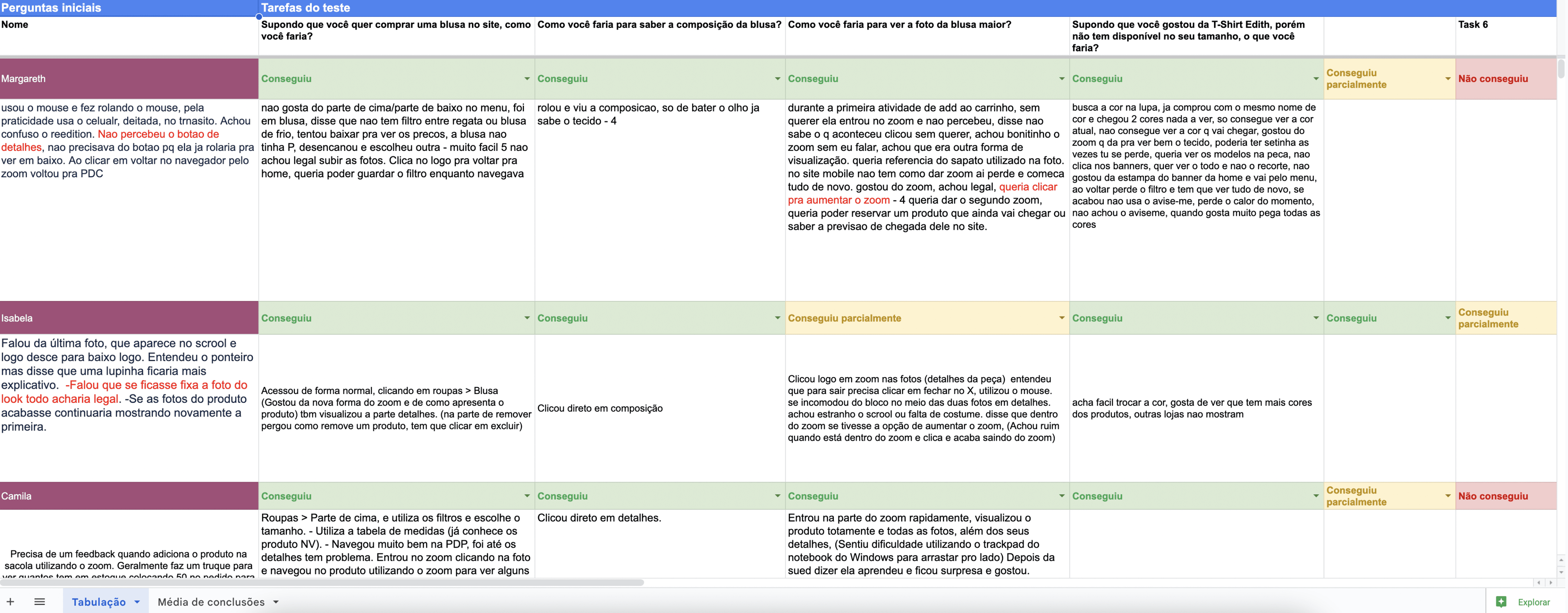
After the test application we collected some ideas of improvements. And our average of usability score was 97.50%.
As shown on the table below.
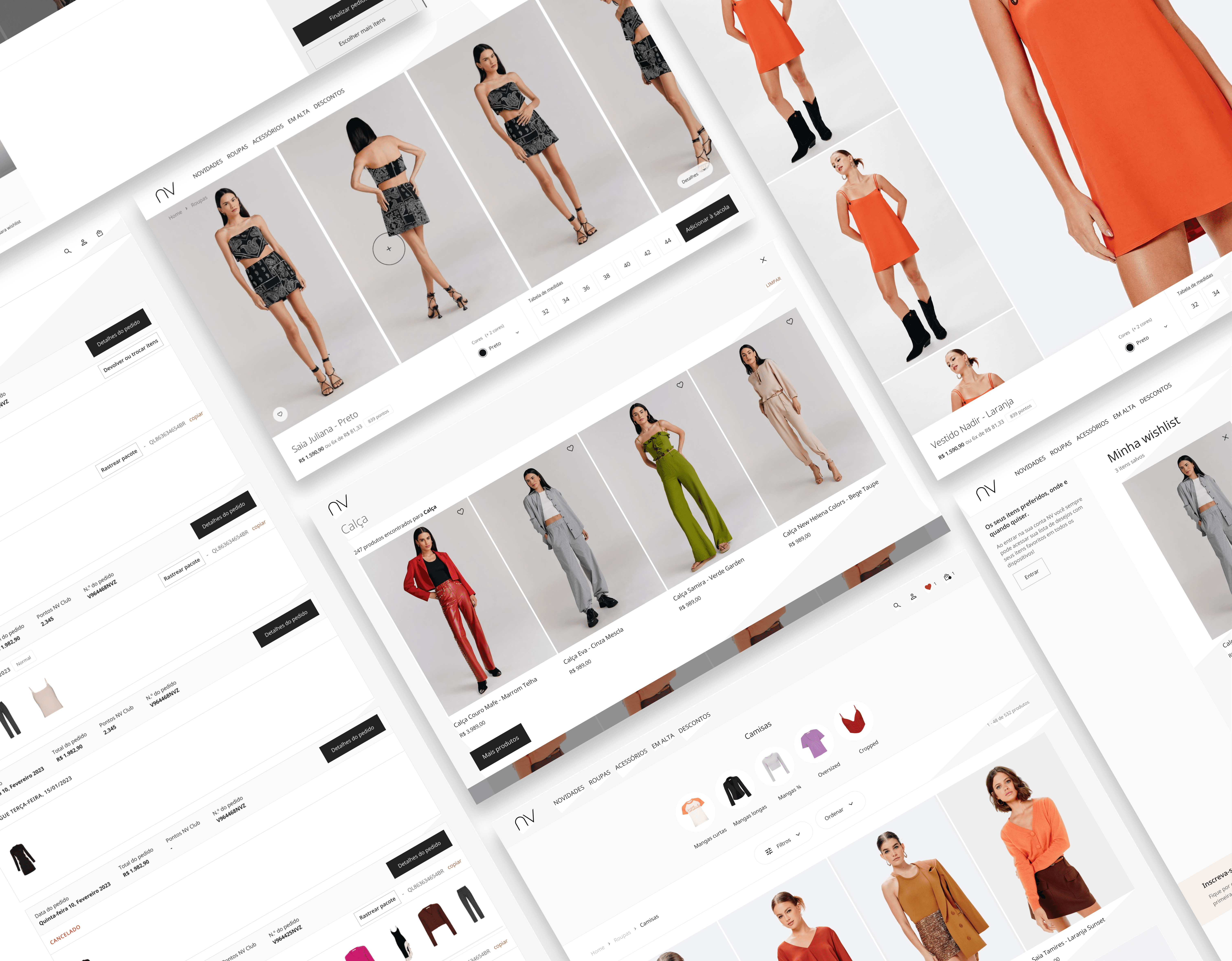
Final Design