Floki and TokenFi Staking
Staking was one of Floki's most-used products, but the experience was far from simple. This project focused on making staking clearer and more efficient.
Making staking simpler, clearer, and more rewarding

The Overview
Product Design · UX Research · UX · UI · Prototyping · Product Strategy
Floki · 2025
Floki is a Web3 ecosystem with multiple products and services, including DeFi, trading, staking, and token utilities. Staking was one of the most-used products in the ecosystem, allowing users to lock their tokens and earn rewards over a selected period.
Despite its popularity, the Staking experience had several usability issues and was a frequent source of user complaints. The experience was fragmented across Floki and TokenFi, important actions were difficult to find, and users lacked clarity around their rewards and staking progress.
As Design Lead at Floki, I worked directly with the Product Owner to investigate these problems, analyze feedback from real users, and redesign the experience around the most important user needs.
The Problem
The Staking experience had grown around individual features rather than a cohesive user journey.
Through user feedback, we identified several problems affecting the experience:
Users had to claim rewards individually for each stake.
There was no Claim All functionality.
Users couldn't start a new stake directly from the My Stakes page.
The Unstake action had more visual prominence than Claim.
The progress bar created a misleading representation of the staking period.
Available rewards and their USD value were not clear.
Users couldn't easily understand their potential rewards before staking.
Floki and TokenFi stakes were managed through separate platforms.
The network selector could make active stakes appear to be missing.
There was no comprehensive overview of the user's staking portfolio or recent activity.
The challenge was not simply to redesign the UI, but to understand which problems mattered most to users and create a more cohesive experience around their core tasks.
Business Goal
Improve the overall Staking experience
Reduce friction across staking and claiming journeys
Make rewards and staking information easier to understand
Improve the discoverability of key actions
Create a more cohesive experience across tokens and networks
Identify and prioritize improvements based on real user feedback
Design Process
User Research → Insights → Prioritization → UX → UI → Prototyping → Development
I started by understanding the problems through real user feedback. From there, I translated the findings into opportunities, prioritized them based on impact and feasibility, and then redesigned the experience around the highest-priority needs.
User Research
Listening to real Staking users
Before redesigning the experience, I wanted to understand what was actually frustrating users instead of making assumptions.
Together with the Product Owner, we created a questionnaire for existing Staking users and collected 300+ responses using Useberry.
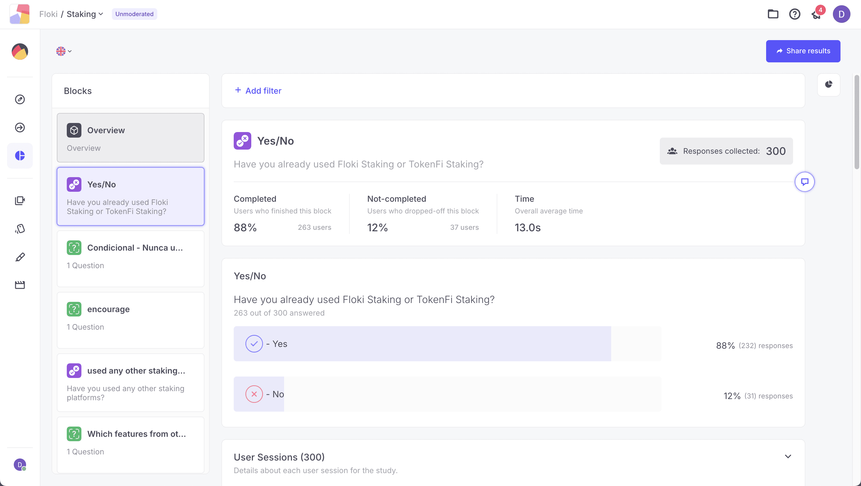
We asked users about:
Problems they experienced
Friction throughout the Staking journey
Bugs
Missing information
Feature requests
Ideas for improvement
Overall usability of the product
The large number of responses gave us enough qualitative feedback to identify recurring patterns and understand which problems were most relevant to the Staking community.
From Feedback to Opportunities
Turning 300+ responses into opportunities
I mapped the feedback and grouped similar responses into categories, allowing me to identify recurring problems, feature requests, bugs, and opportunities.

Some of the main themes identified were:
Clarity: Users had difficulty understanding their staking progress, available rewards, and potential earnings.
Efficiency: Users wanted to perform common actions, such as claiming rewards, with fewer steps.
Navigation: The existing experience made it difficult to move between staking activities and start new stakes.
Fragmentation: Users with both $FLOKI and $TOKEN stakes had to manage them across two separate platforms.
Visibility: Users lacked a complete overview of their staking portfolio and transaction history.
Prioritization
Finding where to start
With so many problems and opportunities identified, solving everything at once wasn't realistic.
I worked with the Product Owner to prioritize the opportunities based on three main criteria:
User Demand: How frequently users mentioned the problem or requested the feature.
User Impact: How much solving the problem could improve the overall experience.
Implementation Effort: How difficult or costly the solution would be for the development team to implement.
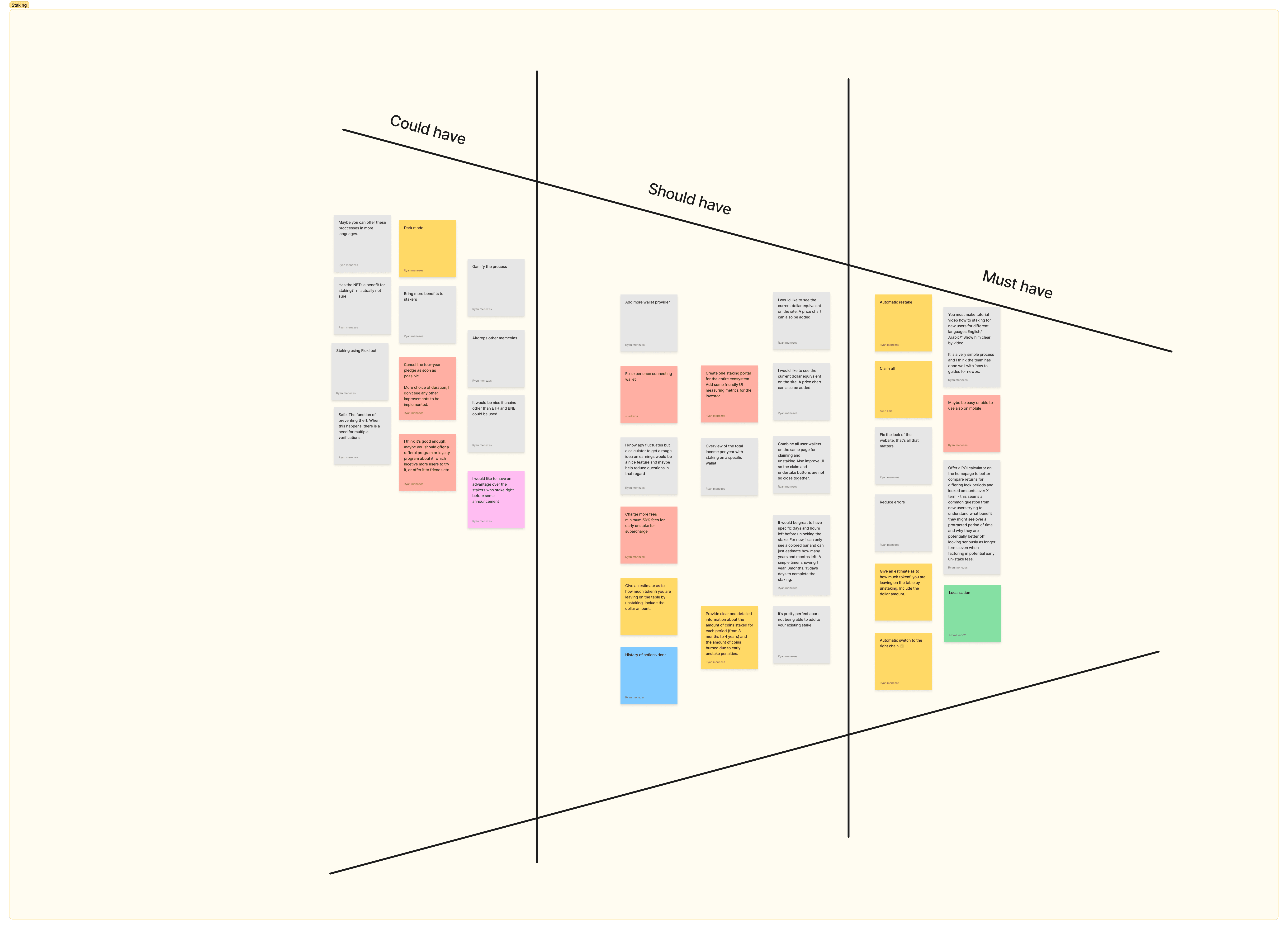
Based on these criteria, I categorized the opportunities into:
Must Have: Problems with high user impact and strong demand that should be addressed first.
Should Have: Important improvements that would significantly enhance the experience.
Could Have: Useful opportunities that could be explored as future iterations.
This helped the product and development teams understand where to focus their efforts first.
Key Problem 01
The Staking experience lacked clarity
The research revealed several issues that made it difficult for users to understand their staking positions and rewards.
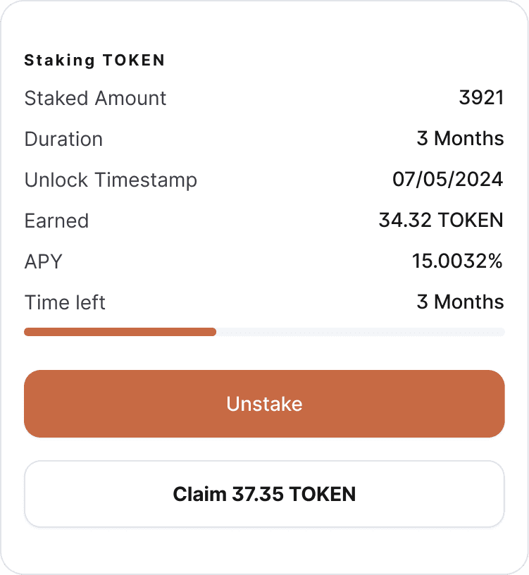
The progress bar communicated the staking period incorrectly.
Available rewards and their USD value were not clear.
The primary action hierarchy didn't reflect users' most common tasks.
The network selector could make active stakes appear to be missing.
Before
The Solution
Making information easier to understand
I redesigned the information hierarchy to make the most important information and actions easier to understand.
The new experience:
Clearly displays available rewards
Shows the USD value of rewards
Gives Claim stronger visual priority than Unstake
Correctly communicates time remaining
Makes assets and networks more visible
After

Key Problem 02
Managing multiple stakes was too repetitive
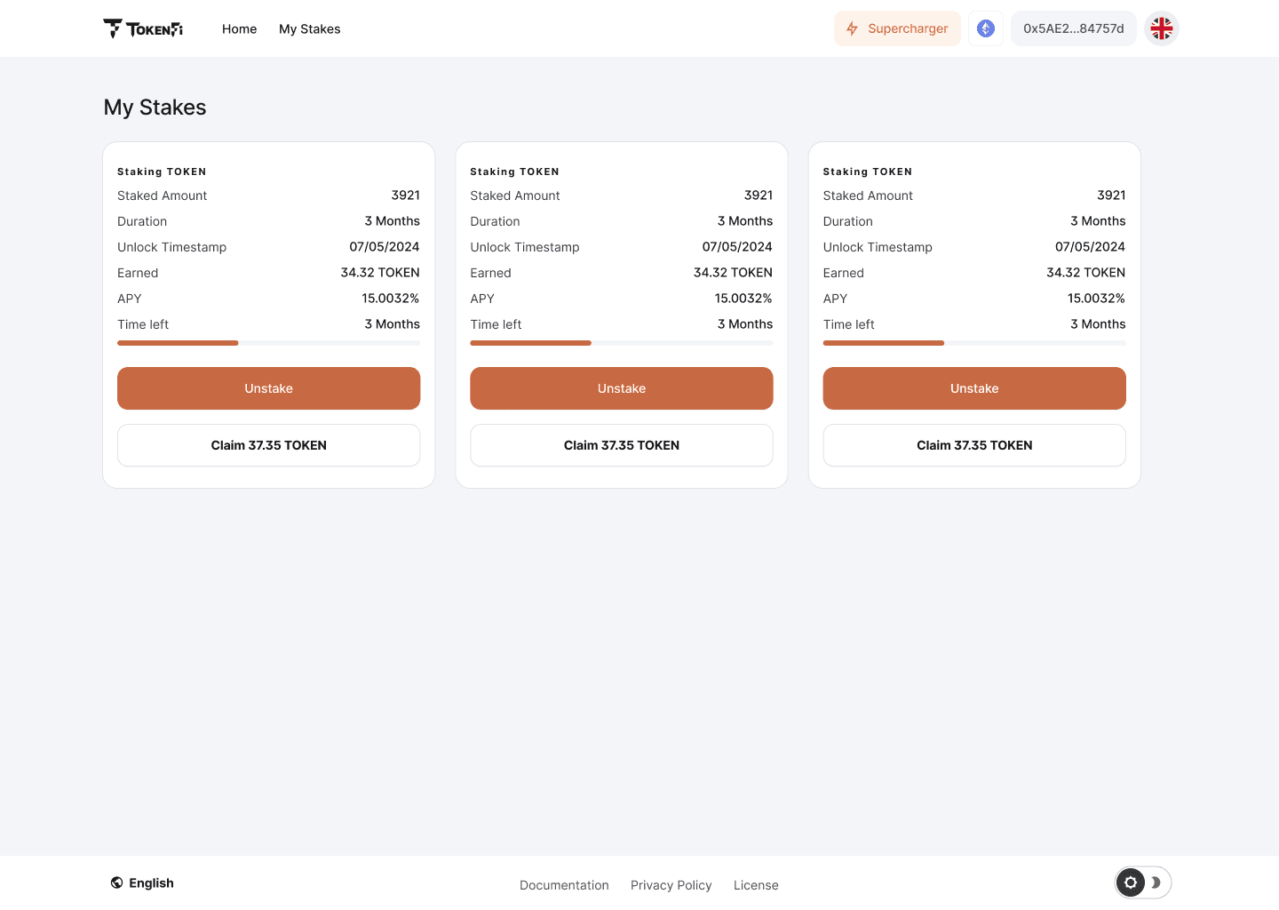
Users with multiple stakes had to perform repetitive actions and navigate through different parts of the product.
There was no way to:
Claim rewards from multiple stakes at once
Start a new stake directly from My Stakes
Easily manage $FLOKI and $TOKEN stakes together
See active stakes across different networks
Before
The Solution
A more efficient staking experience
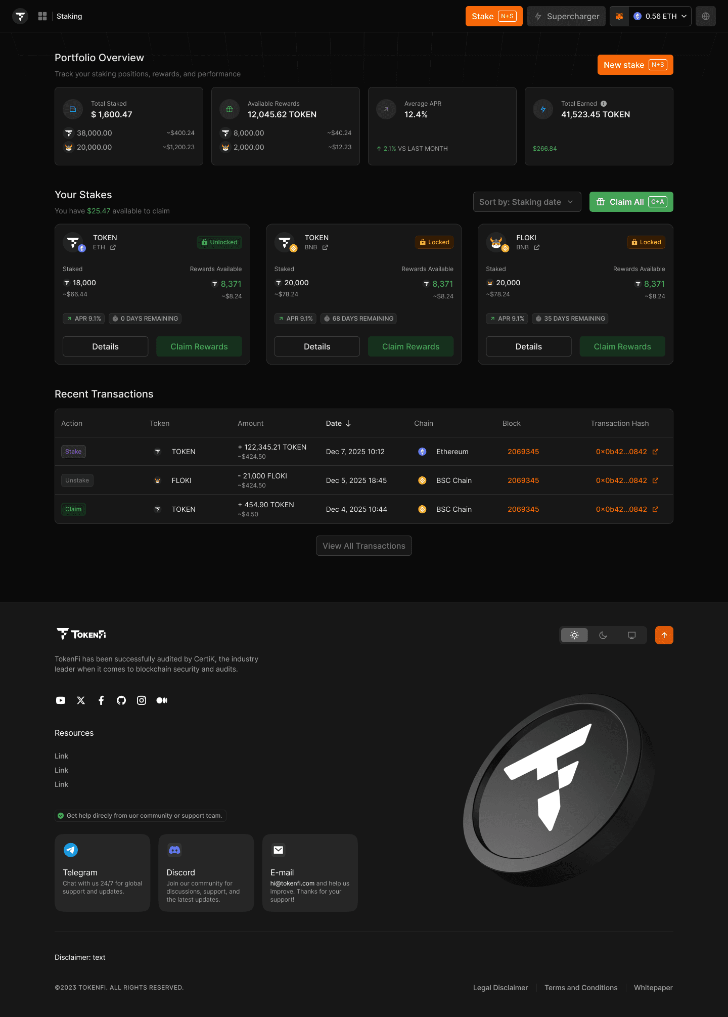
I redesigned the dashboard around the actions users were most likely to perform.
The new experience:
Users can now claim rewards from multiple stakes through a single action. Instead of: Claim → Claim → Claim → Claim
Previously, users had to leave the My Stakes page and return to the landing page to start a new staking flow. I introduced a New Stake CTA directly within the dashboard, allowing users to start a new staking flow from where they were already managing their stakes.
Users can manage Stakes from Floki and TokenFi in one single place and also from different networks, avoinding them feel confused about their active stakes.
After
Key Problem 03
Users lacked a complete overview of their staking activity
The previous experience was primarily focused on individual stake cards.
Users had limited visibility into their overall:
Total amount staked
Available rewards
Average APY
Total earnings
Assets across different networks
Recent transactions
The Solution
From individual stakes to a complete portfolio view
I expanded the experience into a more comprehensive Staking dashboard.
The new experience:
Portfolio Overview: A summary at the top of the page gives users an immediate overview of their staking activity:
Total Staked
Available Rewards
Average APY
Total Earned
This allows users to understand their overall staking position without having to inspect each stake individually.
Multi-Token & Multi-Network Visibility
Bringing the ecosystem together
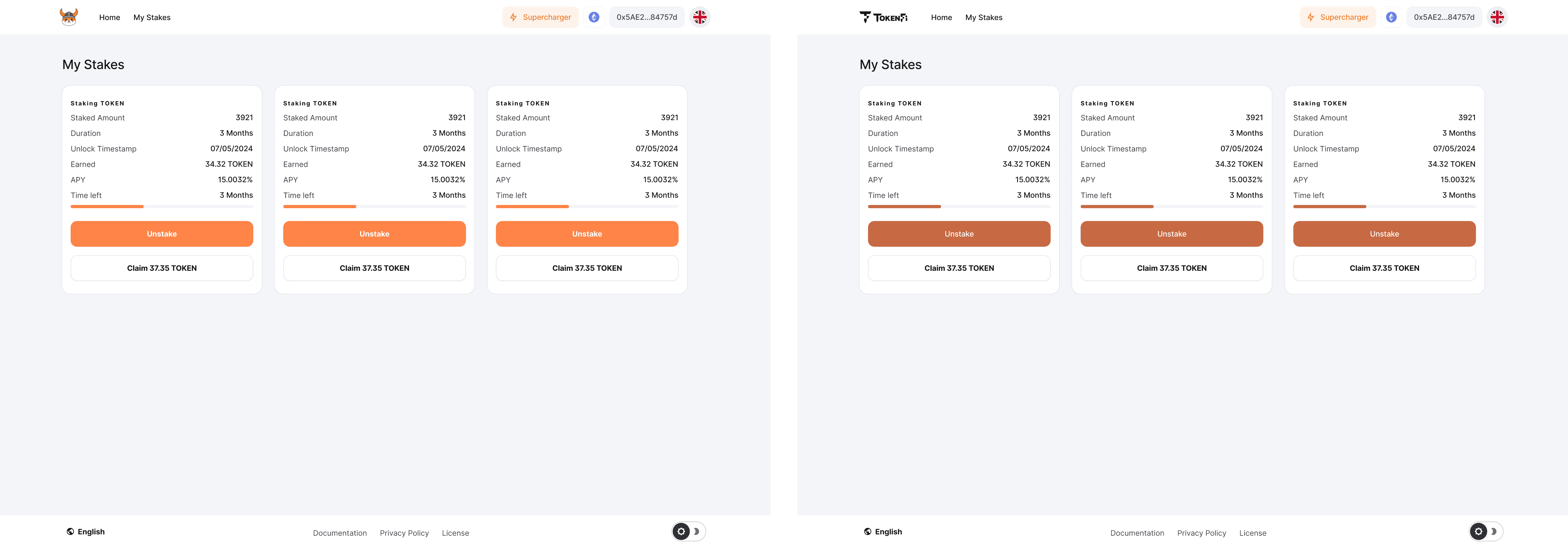
Another important problem was the fragmentation between Floki and TokenFi Staking.
Users who had stakes in both $FLOKI and $TOKEN needed to use two different platforms to manage them.
From a user's perspective, this added unnecessary complexity.
My proposal
I proposed a unified Staking experience where users could manage both tokens from the same platform.
Instead of the token determining which product the user needed to access, the experience would treat:
$FLOKI
$TOKEN
as selectable assets, similar to selecting a network.
The Trade-off
Designing within product constraints
The Core Team decided to keep the Floki and TokenFi Staking platforms separate.
Rather than abandoning the user problem, we looked for a way to preserve part of the benefit of a unified experience.
The final approach
If a user was on TokenFi and also had a FLOKI stake, that stake could still be surfaced within the TokenFi experience.
This meant users could see and manage their FLOKI stake without having to switch platforms just to access it.
It wasn't the fully unified experience I initially proposed, but it reduced an important source of friction while respecting the product constraint.
Network Selection
Avoiding misleading empty states
The previous experience also relied on a network selector at the top of the page.
For example, if a user had a stake on BNB but the selector was set to Ethereum, the interface could display an empty state suggesting that the user had no stakes.
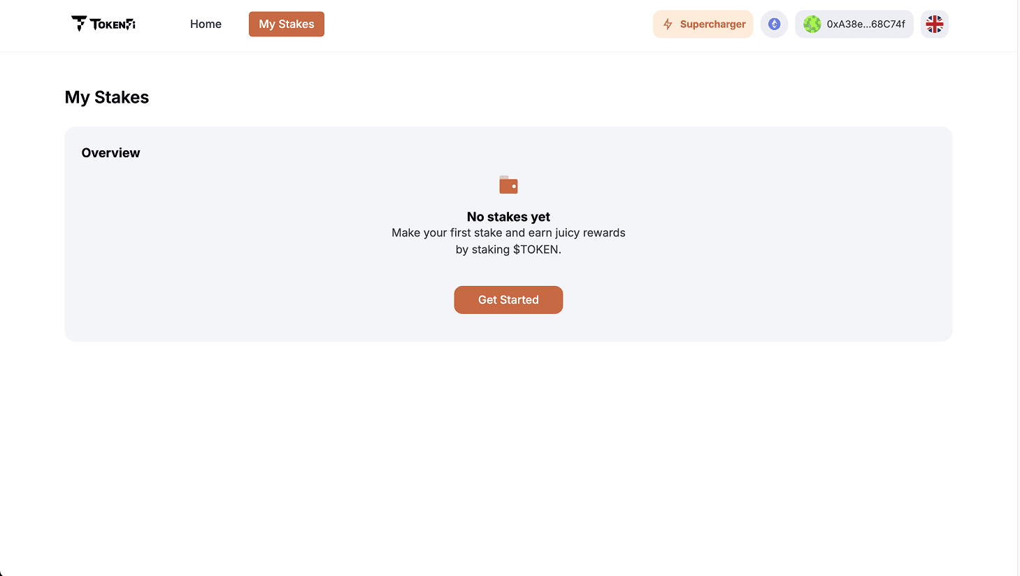
The problem wasn't that the user had no stake. The stake was simply on another network.
This could create confusion and uncertainty, especially for users who didn't understand that the selector was filtering their view.
The Solution
The redesigned experience makes stakes across different networks visible within the same overview, reducing the risk of users interpreting a filtered view as having no active stakes.
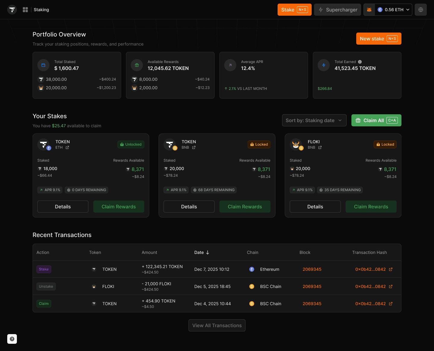
I also included a filter, to allow users to filter their stakings by date, by chain, by amount.
Estimated Rewards
Helping users understand potential earnings
Research also showed that users wanted to know approximately how much they could earn before committing their tokens.
The question was simple:
How much can I expect to earn?
Before
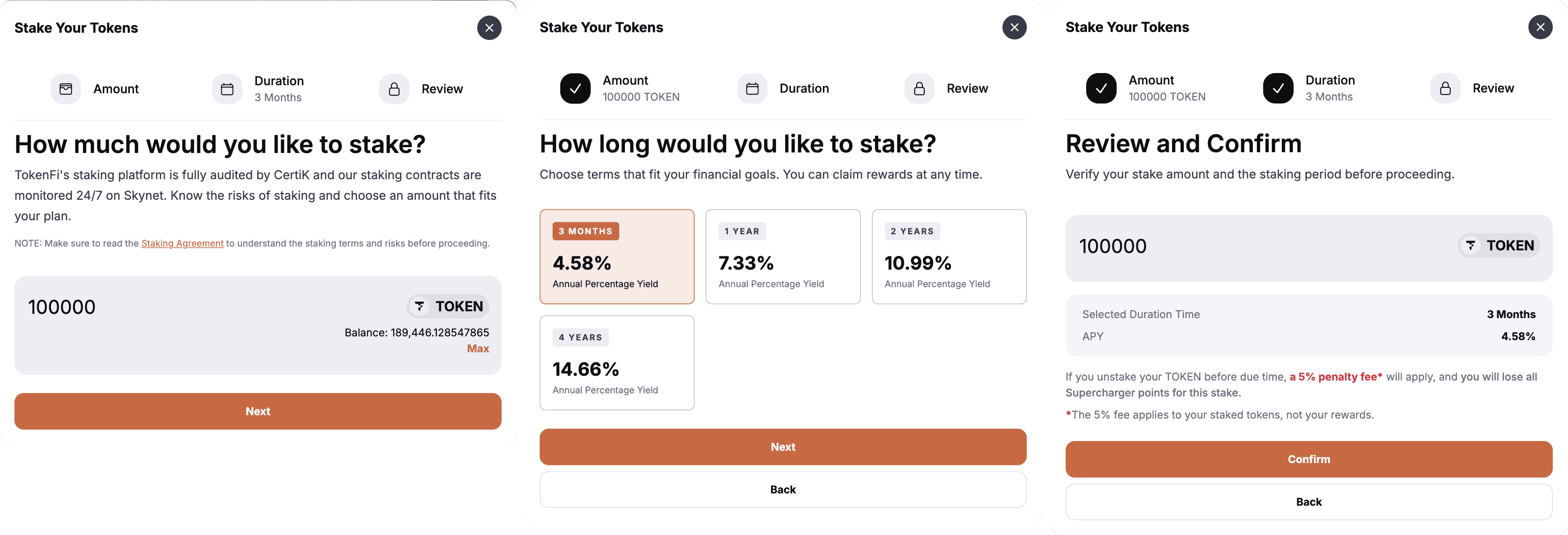
The Solution
I designed an estimated rewards calculation based on:
Amount of tokens + Staking period + Network
↓
Estimated Rewards
+ XXX TOKEN
≈ $XX USD
After

The calculation clearly communicates that the value is an estimate, helping users understand the potential outcome without presenting it as a guaranteed return.
Final Design
A more connected Staking experience
The final design transformed the experience from a collection of individual stake cards into a more complete Staking dashboard.
Key improvements
Clearer hierarchy
Primary actions and important information are easier to identify.Claim All
Users can claim rewards from multiple stakes in a single action.New Stake
Users can start a new staking flow directly from the dashboard.Reward visibility
Users can understand both their current rewards and estimated potential earnings.Multi-token experience
$FLOKI and $TOKEN stakes can be surfaced within the same experience.Multi-network visibility
Users can see their stakes across different networks without confusing empty states.Portfolio overview
A dashboard summarizes the user's overall staking activity.Transaction history
Recent staking, unstaking, and claiming activity is available at the bottom of the page.
What I Learned
Designing beyond the interface
Research helps challenge assumptions
The 300+ user responses showed that some of the most important problems weren't necessarily the ones we initially expected. Research helped us identify where users were actually experiencing friction.
Prioritization is part of Product Design
Identifying problems is only the first step. Evaluating user demand, impact, and implementation effort helped turn a large amount of feedback into actionable product priorities.
Good design works within constraints
The unified Staking experience was the direction I initially proposed, but the Core Team had different product constraints. The final solution wasn't the ideal version, but it still addressed an important part of the user's problem.
Small changes can have a meaningful impact
Improving the hierarchy of actions, correcting the progress indicator, and introducing Claim All were relatively focused changes, but they directly addressed recurring user frustrations.
Final Thought
Making a complex Web3 product easier to understand
This project was about more than redesigning a Staking interface. It was about understanding how users interacted with a complex Web3 product, identifying where the experience created friction, and turning those insights into practical product improvements.
By combining user research, prioritization, UX, and UI design, I helped move Staking from a fragmented collection of actions toward a clearer and more cohesive experience.